1. INTRODUCTION
The starting point for my degree project was the experience of an “in-betweenship”: to be in the middle of two cultures. If language is a bearer of culture and typography the body of language, as a graphic designer I was curious about what typography could be created from this intermediate position. In particular, I wanted to work with methods, tools, and expressions derived from Jewish heritage in order to change my conditions for type construction and language.
I have explored the

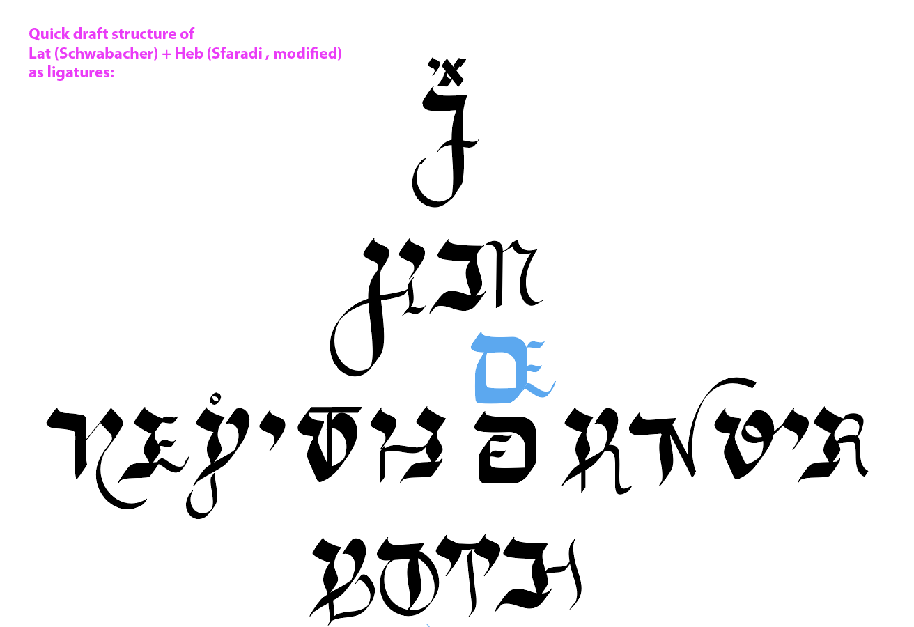
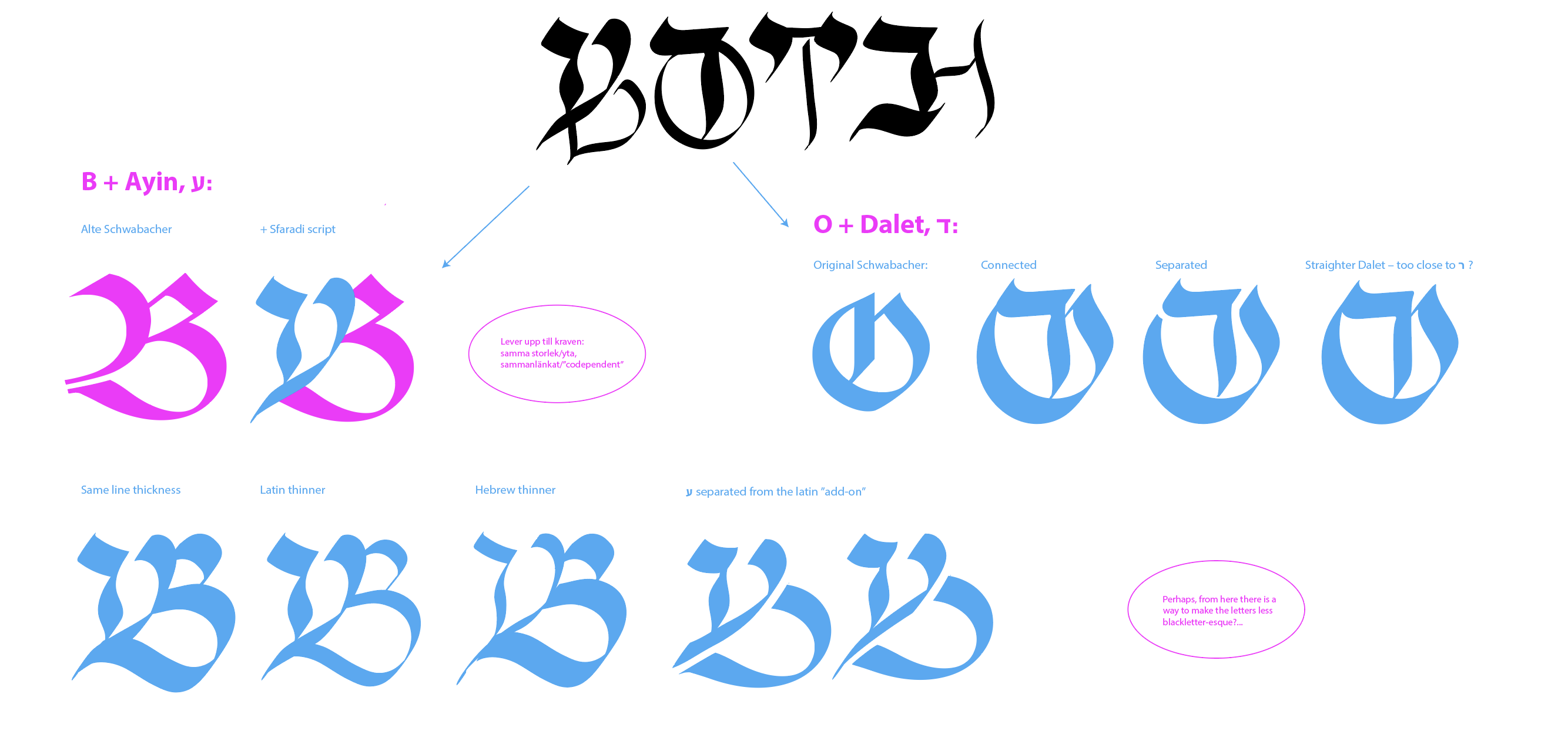
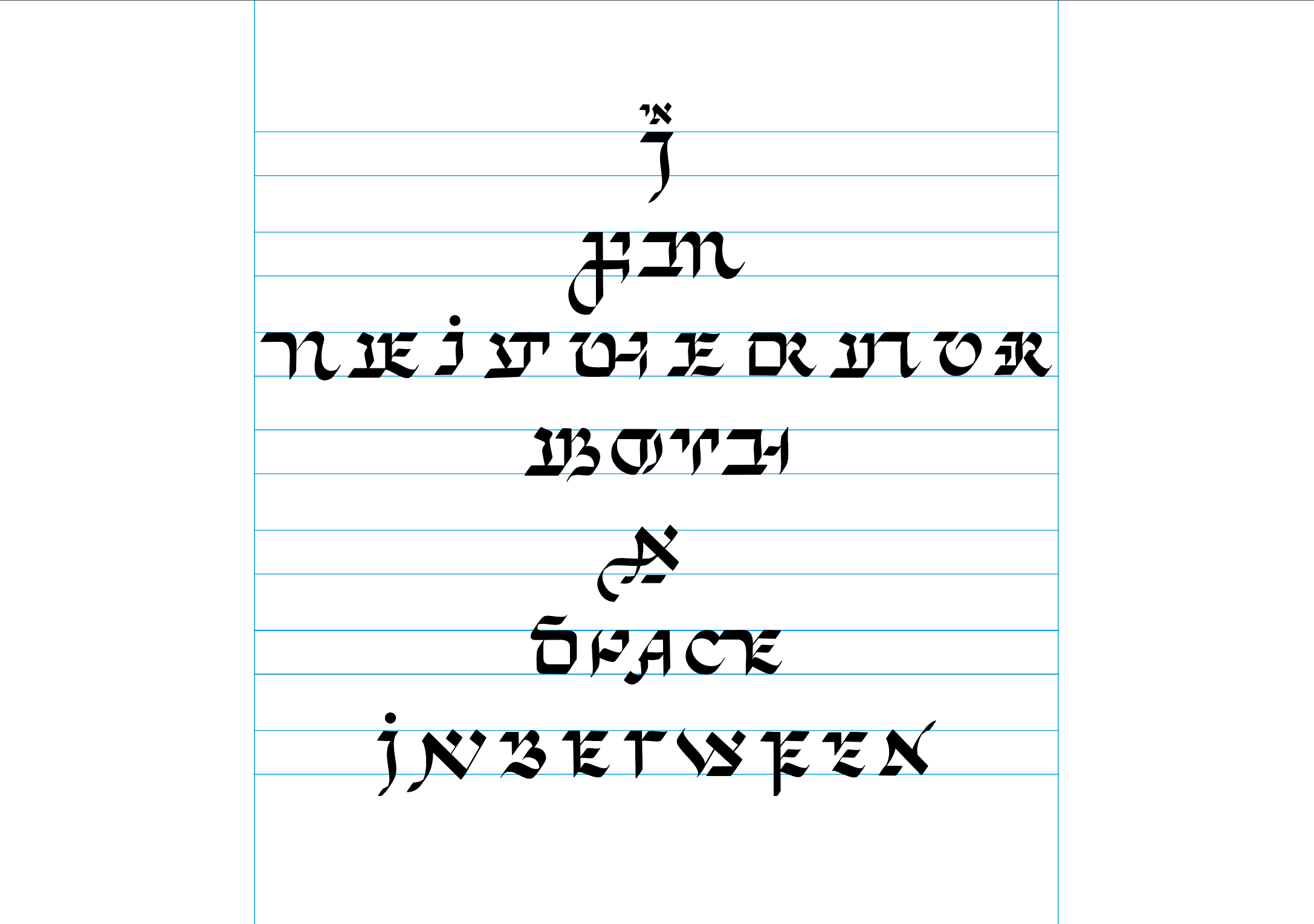
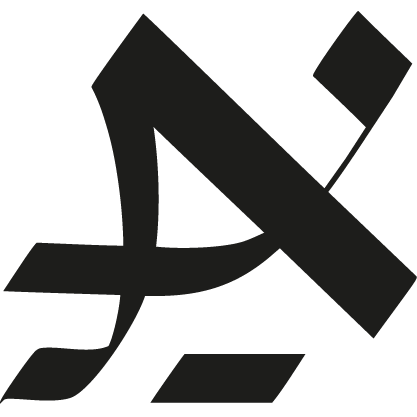
The result is a calligraphic, interscriptual typeface with hybrids of Latin and Hebrew letters that can be read from left-to-right in English, as well as right-to-left in Yiddish. Based on my own poem about this in-betweenship, the visual appearence comes from the codependency between the two scripts, a well as the compromises this merge entailed. This way, it doesn’t only represent my own hybridized experience but also the Jewish experience at large, shaped by influences from other cultures and languages over centuries of flight and migration.
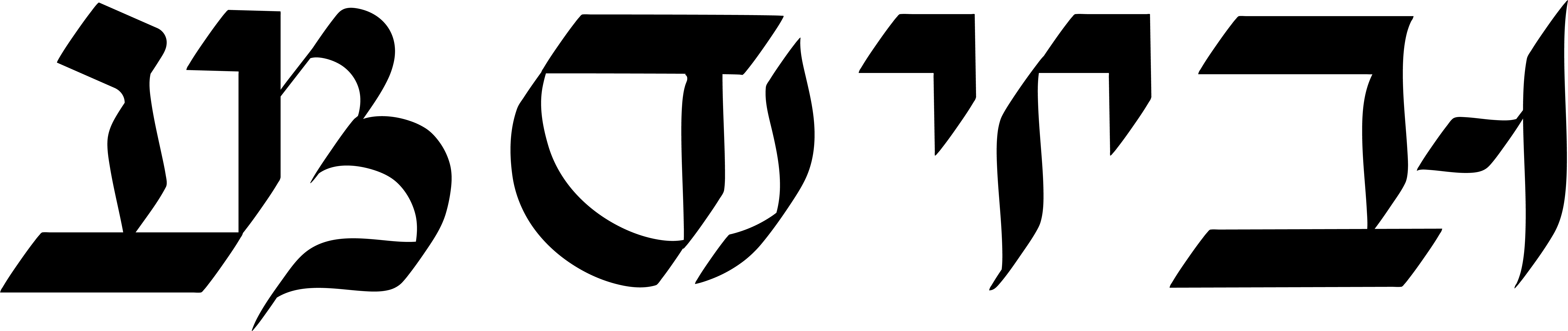
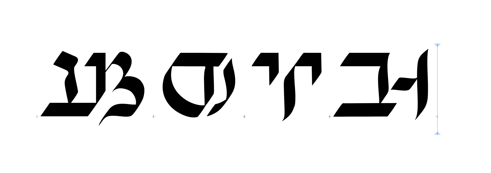
Latin (English): BOTH + Hebrew (Yiddish): ביידע
2. CONSTRUCTION
Inter– (prefix) 1
- between, amid, among
- within
- during
- mutual, together
- reciprocal, to each other
Script (noun) 2
- something written: text
- a style of printed letters that
resembles handwriting - written characters: handwriting
- alphabet
I decided to work with Yiddish and English as the two main languages of this project; Yiddish because of its connection to my family and the homely soundscape growing up, and English mainly for its status as a world language.3 Coming from a Swedish background, I had to learn the language as well as the script – both its concrete structure as well as how it worked linguistically. Not only was this a necessity for creating an interscriptual typeface, but also a way for me to reclaim a lost part of my heritage and identity.
Yiddish is closely related to, if not almost inseparable from Judaism, and by that, part of a heritage I carry ethnically, culturally, socially and visually. It is a mix of Hebrew, German and Slavic languages and is known as the “mother tongue” within Jewish communities (in contrast to Hebrew, which originally was considered a sacred language for religious texts). A modified version of the Hebrew alphabet is used for writing, and today it is considered one of Sweden’s minority languages. With both my experience and the blended nature of Yiddish in mind, the hybrid script would not only become an embodiment Yiddish in itself, but also the Jewish experience as a whole.4
Some other aspects of the Hebrew script that were important to consider during the process were the following:
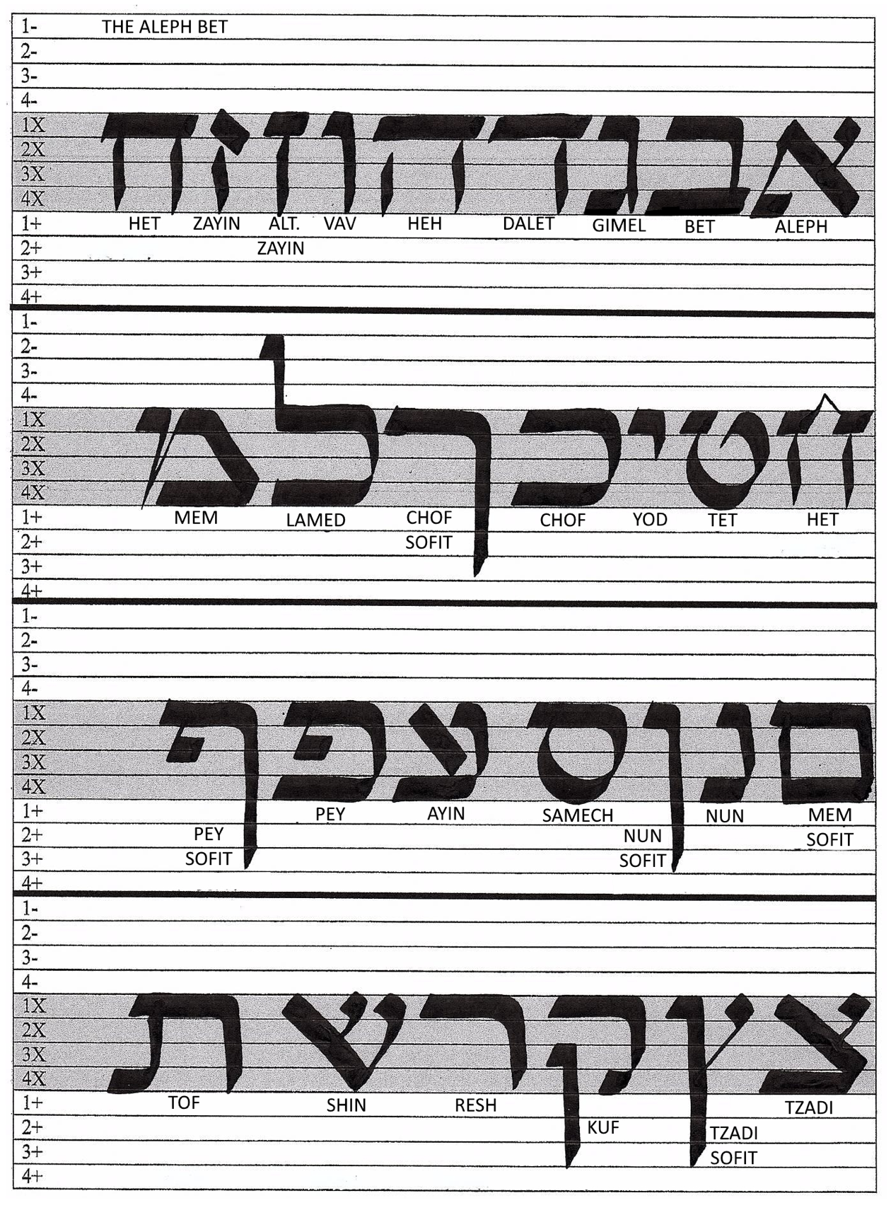
Yiddish alphabet with block letters
& handwriting script
I decided to learn the script like I’d learned the Latin alphabet as a child; directly with my hand. The reasons were many: to get a practical understanding of each letter’s characteristics and a more personal connection to them, to remember the letters more easily by engaging both my visual and my kinesthetic memory, to store them in my muscle and cognitive memory, and to avoid any software limitations as much as possible. This led me to take courses in both Latin and Hebrew calligraphy (parallel with learning the basics of Yiddish through the language-learning app DuoLingo).
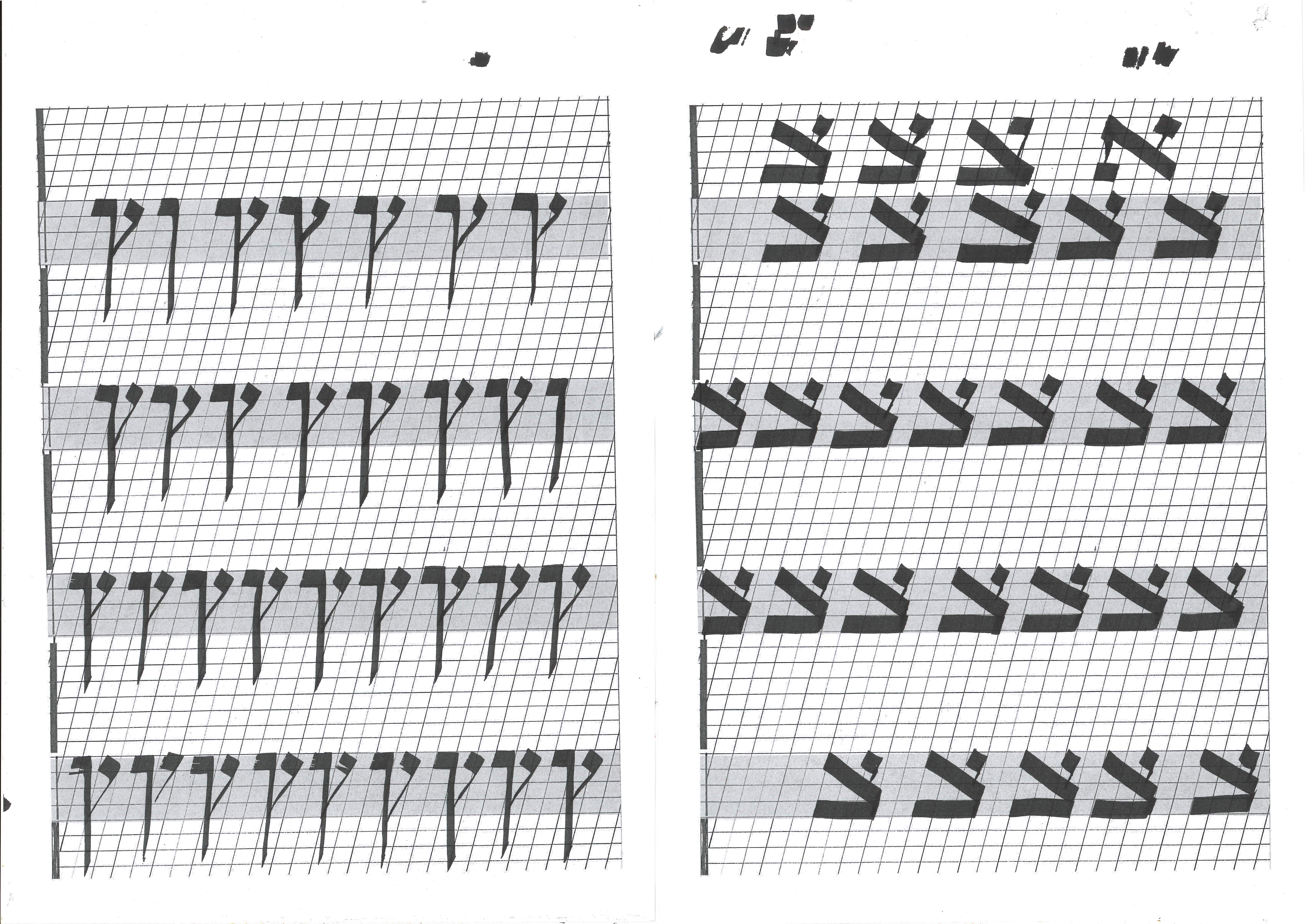
Excercise sheet, Hebrew calligraphy

Example of limitations in Adobe Software settings when working biscriptually
2.1 LATIN CALLIGRAPHY
with DIPAK LAHIRI

During this course, I learned how to create easily recognizable cursive letter forms. It also became clear to me that the more ornate and calligraphic the forms were, the more forgiving they were for a beginner like me, since the body doesn’t move in straight lines or perfect circles.
2.2 HEBREW CALLIGRAPHY
with RIVA BROWN

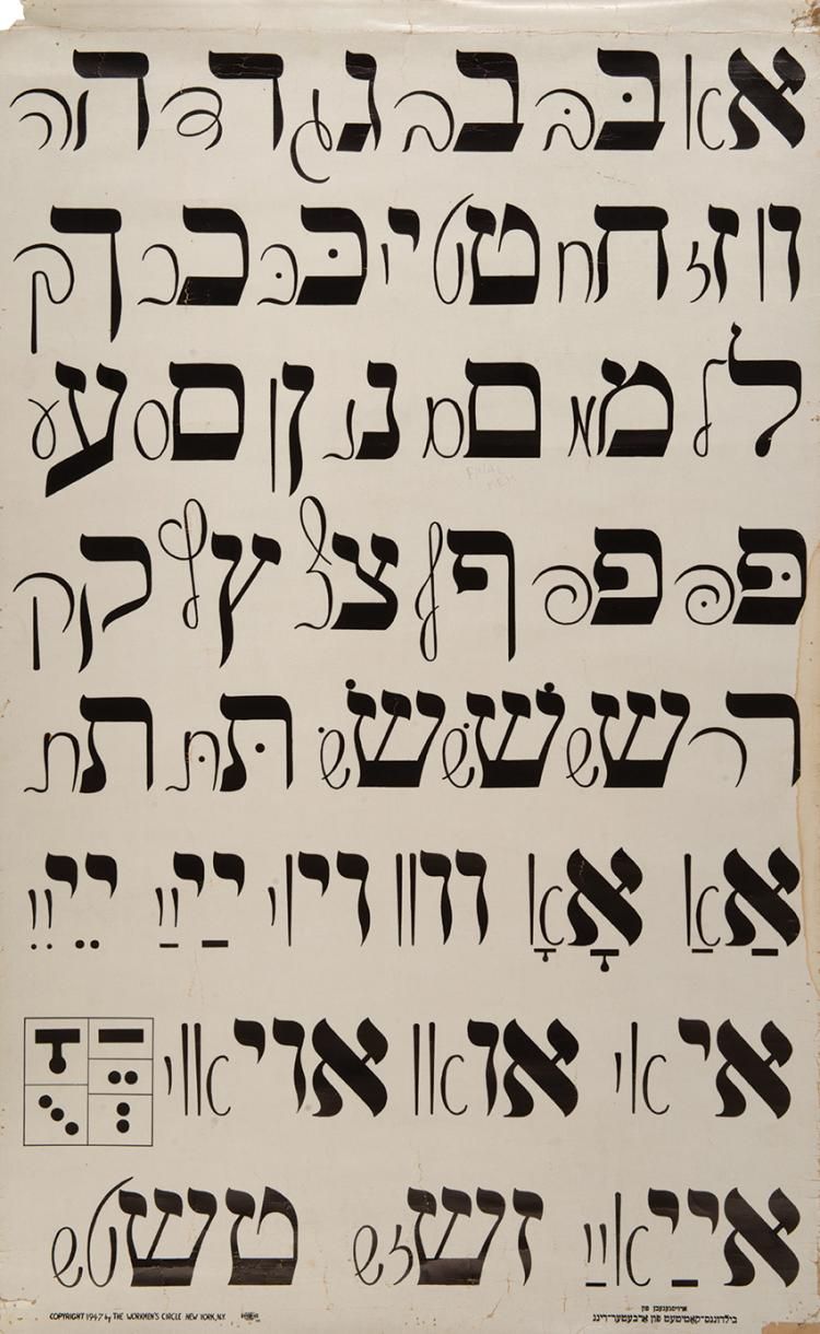
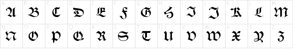
Since I couldn’t find a local course in Sweden, I signed up for a remote Hebrew calligraphy course with Jewish calligrapher Riva Brown in Delaware, USA. Hebrew calligraphy is a traditional Jewish artform, and Riva grew up as an active member of a Jewish community. But even so, she wasn’t allowed to become a Hebrew scribe in the early 70’s because of her gender; a career reserved for men, with a monopoly on both the required materials as well as knowledge of the many rules within this tradition.6 This forced her to become self-taught; she studied art and copied traditional Hebrew texts that she found in her library, until a rabbi asked if she wanted to write a type of marriage document called Ketuba. The script she taught us during the course was largely the same script she created for these documents, but somewhat simplified with a Western writer in mind – in a sense, for marrying two people, scripts, languages, and cultures.
 Riva Brown’s calligraphic alphabet
Her experience illustrates to a great extent the concept of the in-betweenship; being neither fully included nor excluded, forced to create one’s own space in between two opposing positions. Being Jewish included her enough into the community, but being a woman excluded her from pursuing the career she desired within the same community.
Like traditional Jewish calligraphy, Brown’s script applied to block letters. I decided to work in this style since it was representative of Hebrew in my home growing up, and because the block letters fit the squareness of Latin capitals without becoming too much alike. As both her experience and method was in line with the concept of my project, I decided to use the result of her experience and labour — i e. her simplified and angled script — as the Hebrew base for the hybrids.
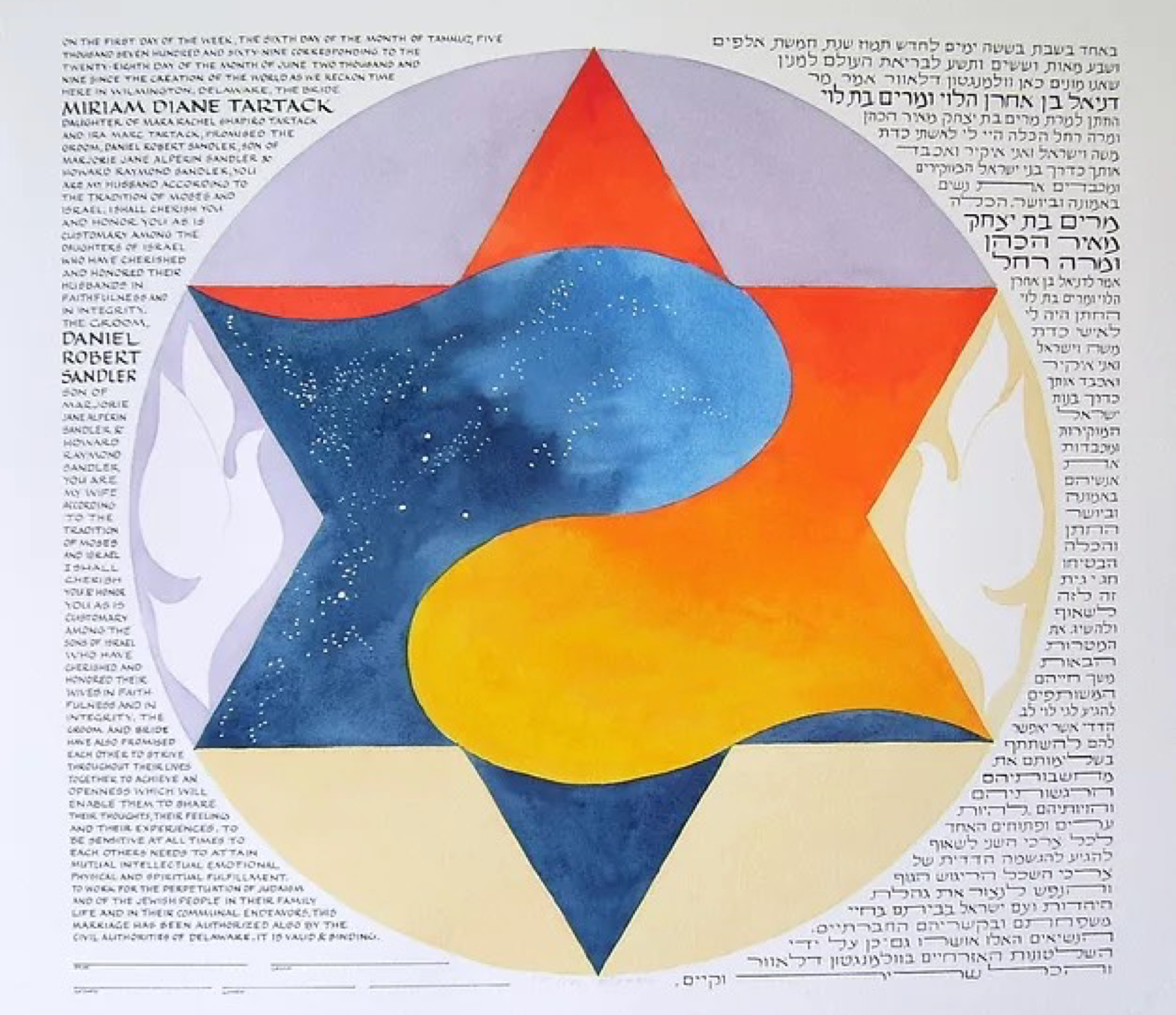 Ketuba by Riva Brown
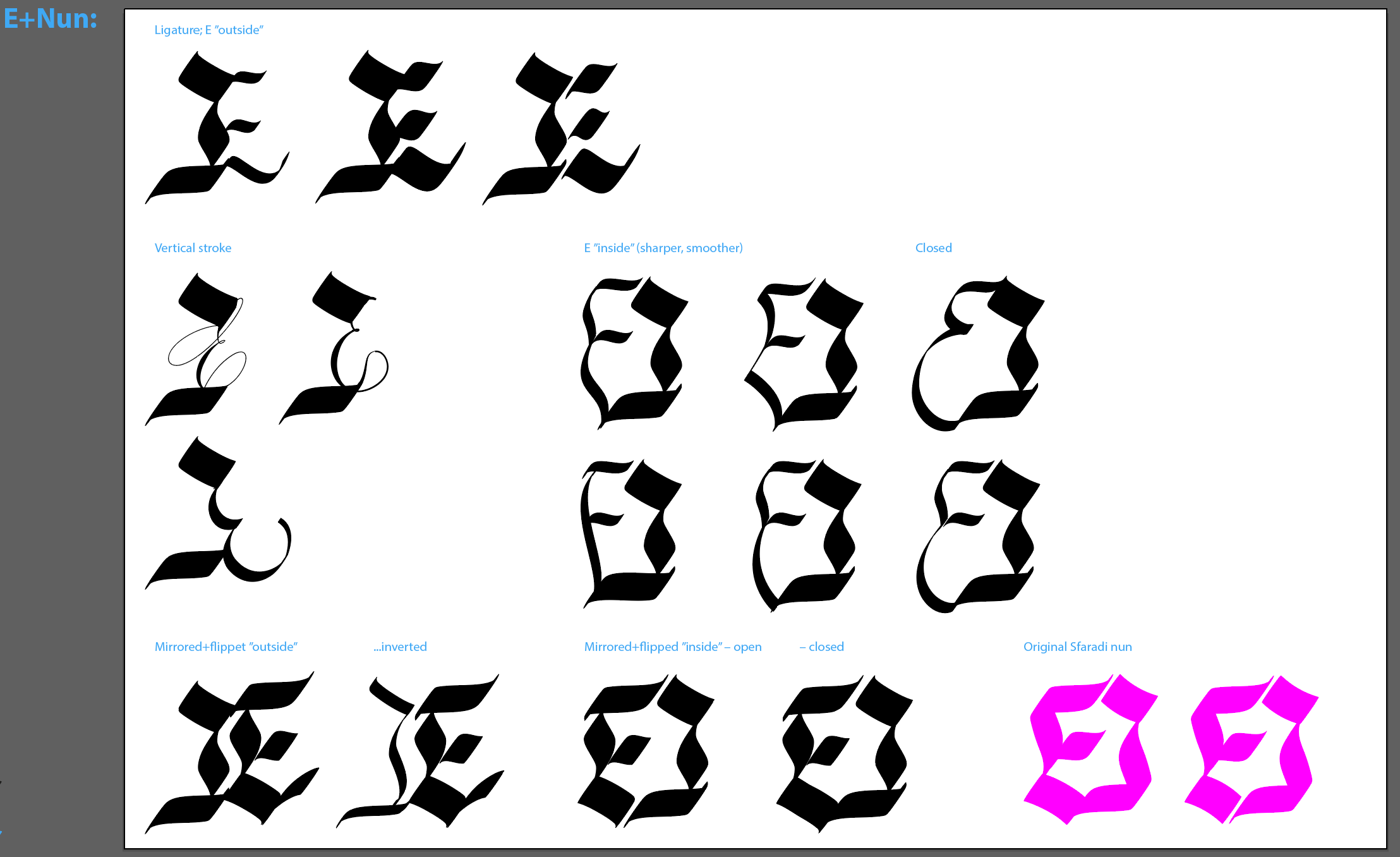
2.3 LIGATURES

ה + H
The earliest sketches of the hybrids became a symbolic gesture for me, where I could merge two seemingly constrasting parts of my identity with tools I felt comfortable using. Here, they were dependent on each other, intertwined, yet with their function intact. These drafts resembled quite arbitrary ligatures:
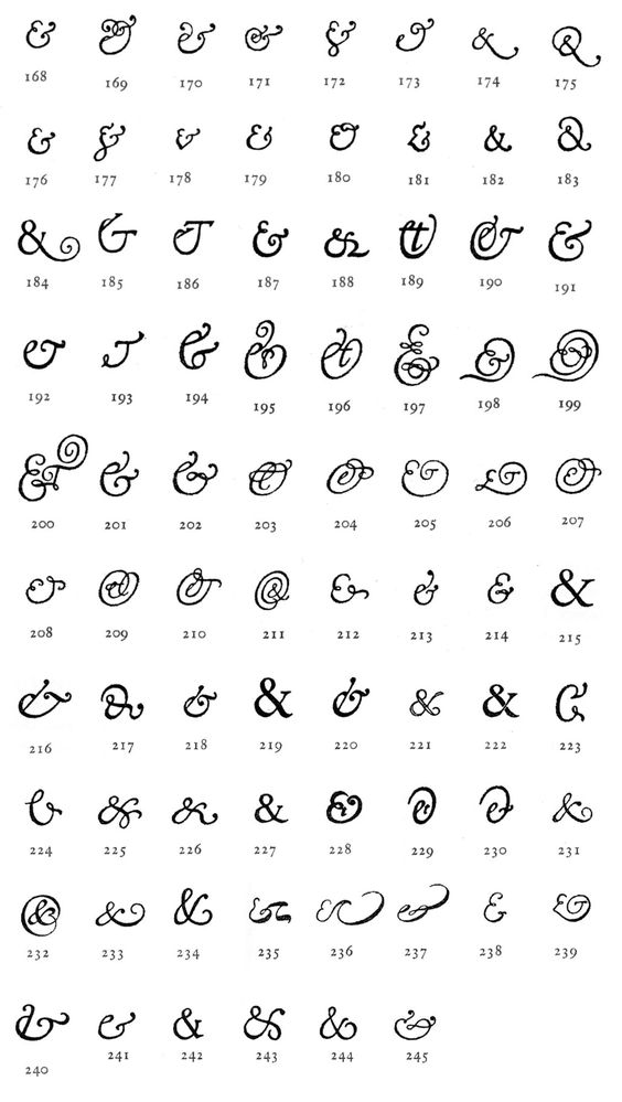
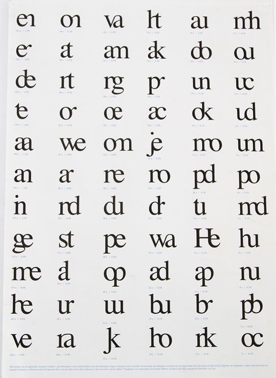
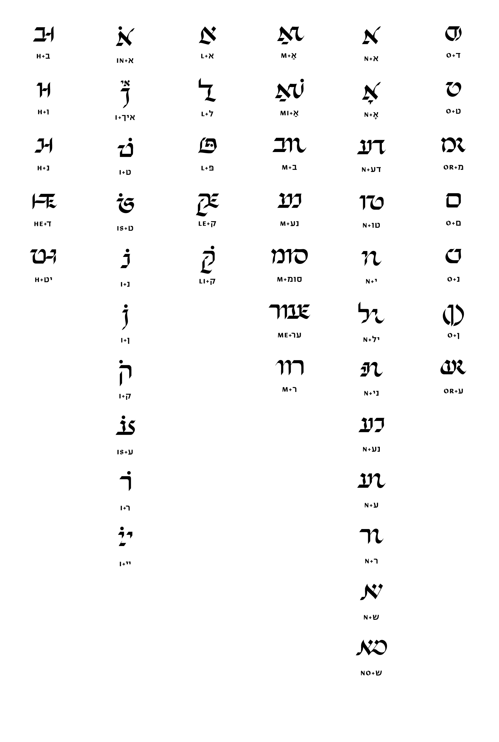
Ligature comes from the Latin word “ligatus”, meaning to tie or bind, and it consists of two or more letters crafted into one single glyph. Originally created for saving time and space in typesetting, as well as facilitating a more harmonious visual experience, they began to fall out of use in the 50’s due to the increased use of sans-serif fonts and typewriters.7 In this project, they became a tool for finding common denominators between two structurally different scripts. I decided to allow for the full range of possible combinations: horizontally, vertically, inside/outside (contained within another letter or as part of it), superscript/subscript, etc.
2.4 THE SCHWABACHER BLACKLETTER
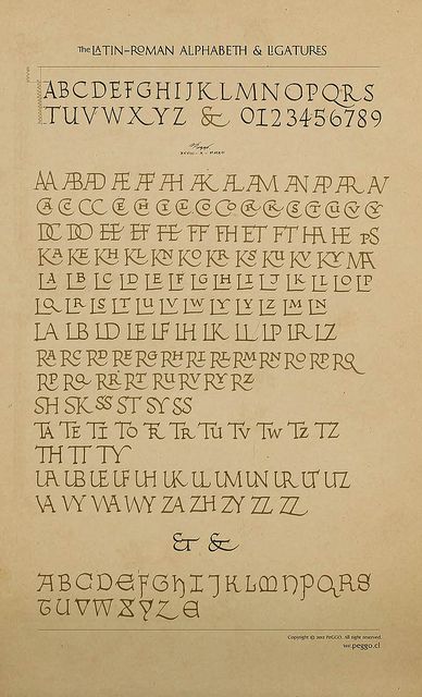
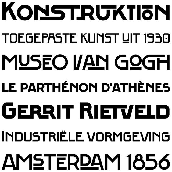
However many type genres and styles I tried, I was constantly drawn to the blackletter because of its versatile nature. A single glyph could contain a variety of shapes and strokes: edges, angles, straight, undulating, thick, thin, protruding, internal... Hence, I decided to work with it despite of its political and controversial history. Being both appropriated and later disowned by the Nazi regime during the first half of the 19th century, the blackletter has been a conflicted topic ever since (regardless of its extensive history dating back to the 12th century), which seems rather unfair to such a rich typographic genre. I decided to avoid giving this part of its heritage more weight by reclaiming the blackletter in this project.8 It solved enough practical issues, f ex. when merging a round and a straight letter (like O and ד) to be an interesting starting point. Therefore, the Latin base became the capitals of the Schwabacher blackletter. Compared to Brown’s script, it is more round and fluid, and to other blackletter styles not too difficult for a modern reader, yet varied enough to open up for a multitude of possibilities.
 Schwabacher Capitals
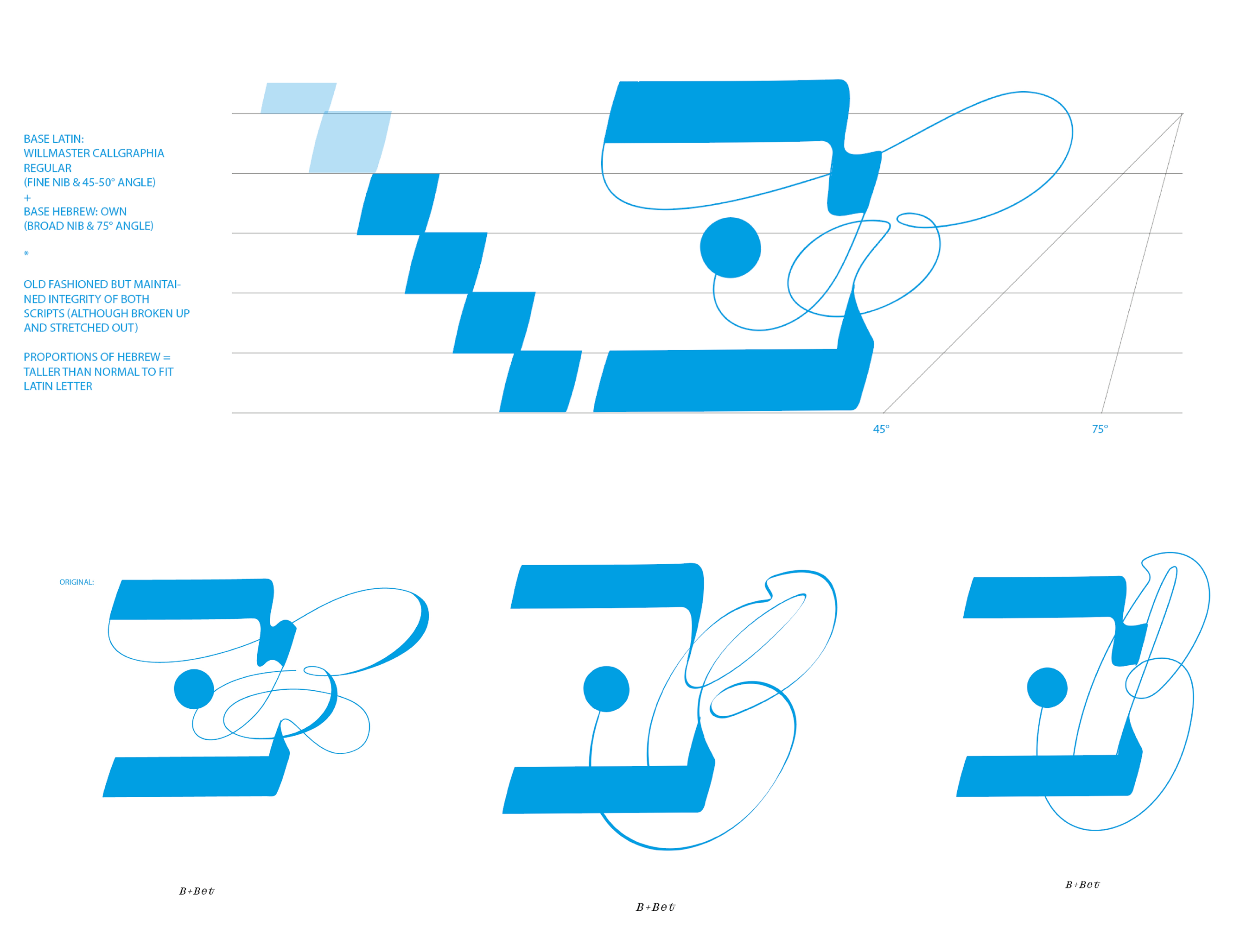

Examples of early style & merge tests
2.5 PRACTICAL DEVELOPMENT
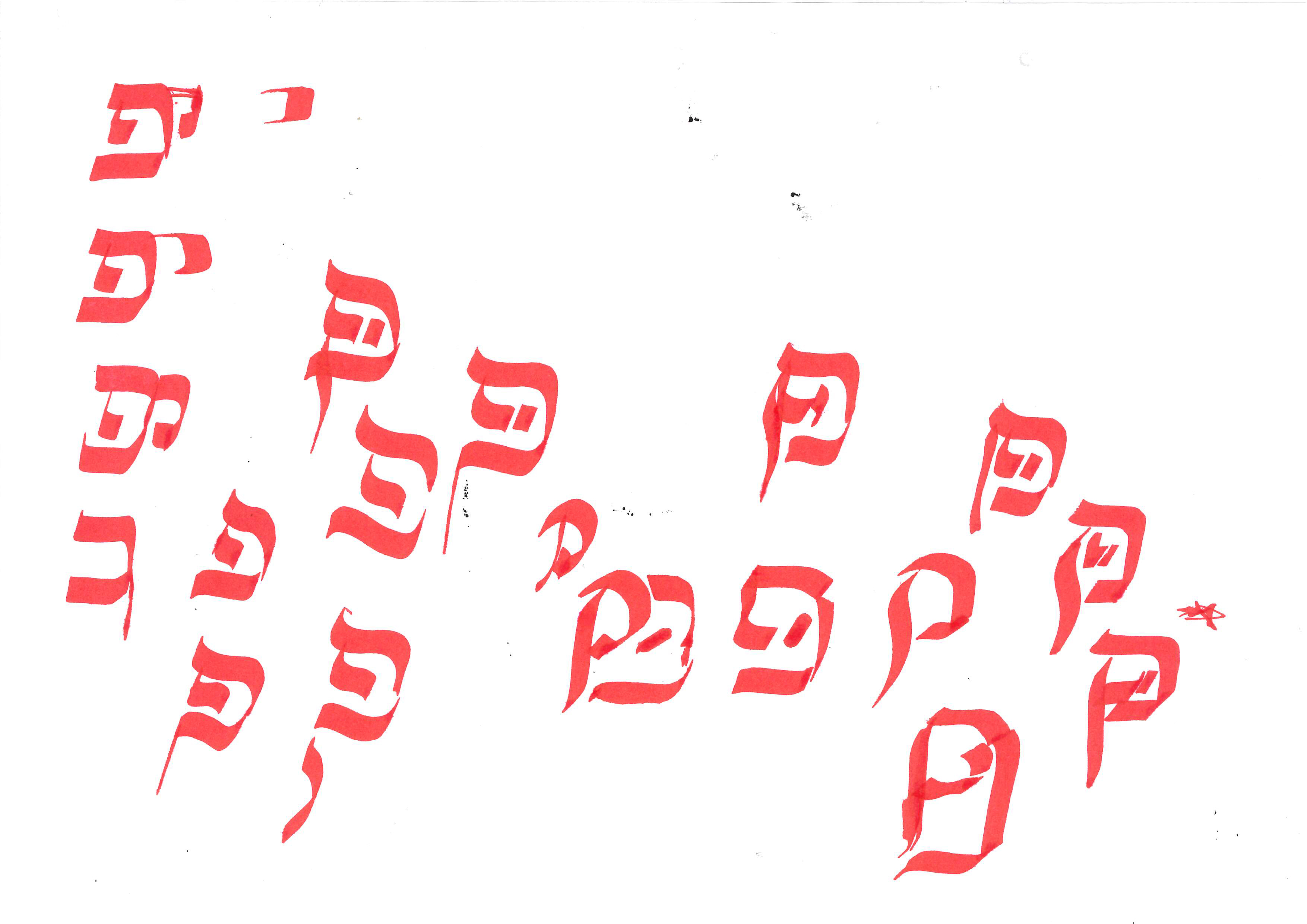
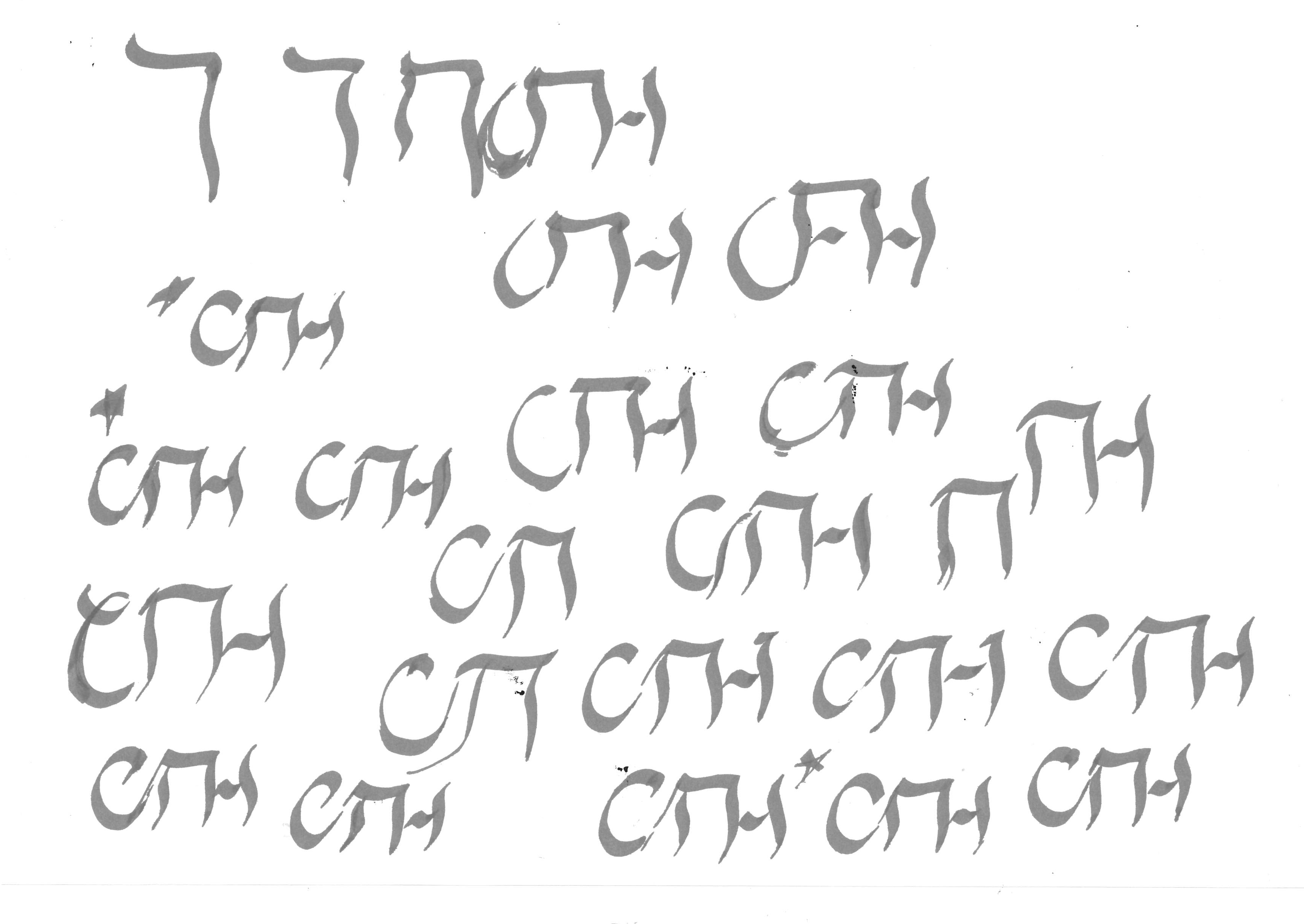
For the sake of implementing non-dominant methods and expressions9, it was important for me to begin from the Hebrew letter to make it complete and able to stand on its own, while the Latin letter came afterwards like added ornaments to the Hebrew base. This method came naturally to me since I know more about Latin letter forms and how I can tweak them, but also because I strived to avoid a Latin-centric starting point, as is the norm.
For each letter combination I made several analogue drafts, then chose one to digitize and refine with a pen tablet in Illustrator. This to not lose the connection with my hand while also being able to work more efficiently digitally. I created a digital calligraphic brush with an angle in-between conventional Latin (~40°) and Hebrew (~70°) calligraphy10 of 55°. I tried to make the beginning and the end of each word as legible as possible, to open up for more variations in the middle.
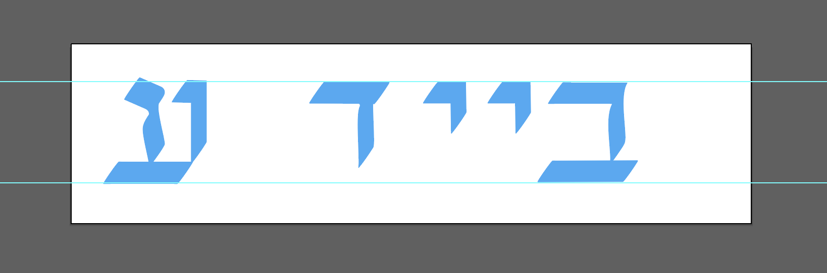
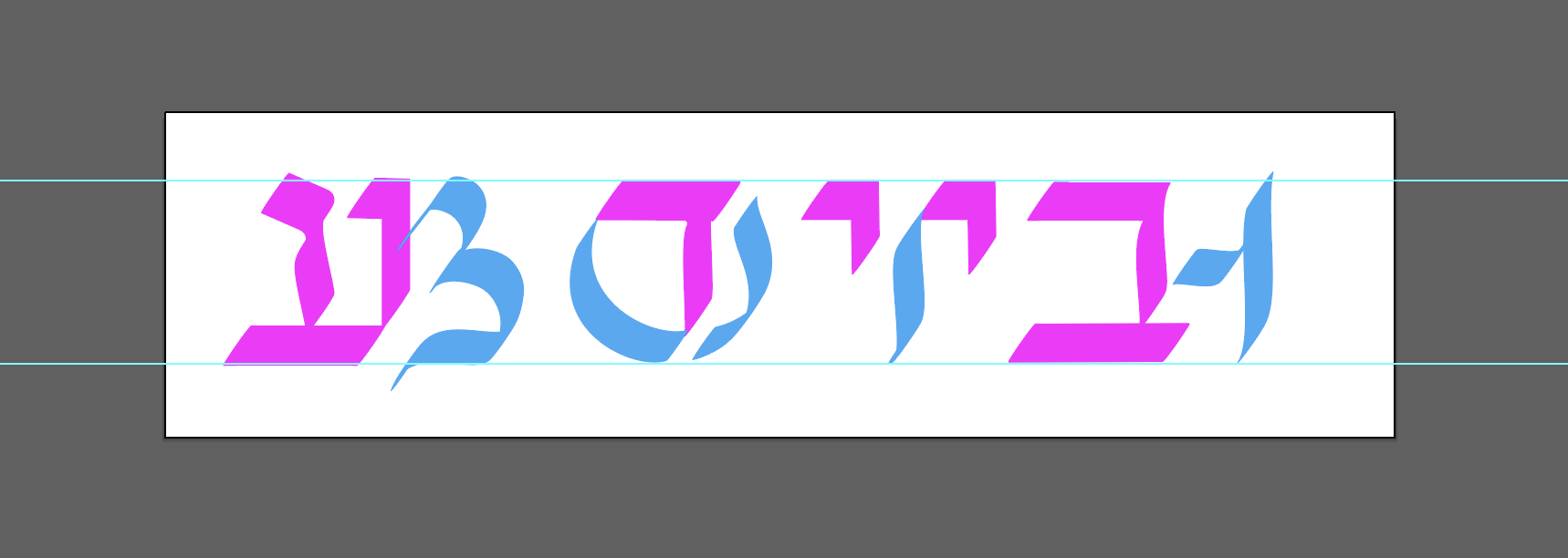
I also decided to limit the amount of letters to one poem about the in-betweenship. Written in English for the sake of accessibility, it was merged with the translation in Yiddish. This way, it worked both as a source text and type specimen.

Early sketches
After typesetting a first draft, I sent it back and forth to friends, family, as well as my external tutor, Israeli typographer Liron Lavi Turkenich. Since I wouldn’t have the time to cultivate a professional eye for Hebrew letters during the timeframe for this project, her help and guidance became invaluable. Through several discussions, meetings, and iterations the script developed.
Draft overviews of text and hybrids


Test, spacing: English – None – Yiddish

Online feedback with Liron Lavi Turkenich


Type construction in Glyphs

Font file, final version
2.6 SUMMARY & DISCUSSION
My goal with this project was to find a typographic representation and a visual voice for the experience of an in-betweenship. The intention was to create a system specifically based on the premises that this position provided. This meant that it wasn’t intended to become a conventionally functioning, typographic system adapted to an existing framework; the in-betweenship set the rules for method of construction, function, as well as visual appearence.
As important as it was to maintain some level of communicative qualities, I also wanted to cultivate a personal sense of agency – during the process as well as of the outcome. The project aimed at finding opportunities in a position that is generally more stifling than empowering, and I wanted it to inspire others with similar experiences to recognize this as well.
Insights that led to a change of perspective on the Latin script came with the practical work: for example, I noticed an integral softness and essentially organic structure in Latin letters that appeared gradually as I was working in parallel with the Hebrew block letters.
A lot of the design choices were based on technical aspects rather than aesthetic preferences. The script had to relate to familiar conventions in some way; here, those ended up being more historical than contemporary (with the usage of the Schwabacher blackletter) because of their complex and inclusive nature. Since I decided to work with translations of each word, the script could only be set in a centered and vertical layout, to make the translations correspond to each other. At times, this also led me to create hybrids of three or more letters, even up to five at one point. Practical problems required practical solutions, and I allowed myself to focus on these primarily, leaving the historical and connotative aspects for later.
Even from the earliest drafts, I knew the result would be difficult to read and the structure complex. However, I didn’t mind this since it reflected my own conflicting sense of the in-betweenship, as well as told a (visual and textual) story of the difficulties of merging two contrasting cultures. I wanted to include the hardship as well as embracing the possibilities that resided within this experience into the script, to make it mindful of this complexity. Therefore I decided to go with a solution that forced the reader into a similar, demanding state of compromise; with reading direction, letter forms, cultural and historical heritage, etc. Furthermore, I didn’t want the script to put a softening filter on the merge of two cultures – however beautiful it might be – for the secondary reason that it could pose a risk of being misused at the hands of oppressive power. In my opinion, an outcome taking several conditions into consideration presents more honestly than a flawless system, as it highlights norms, conventions and expectations by not fully adapting to existing framework. To me, this proves the benefit of a complex-natured visual expression; taking both sides into consideration – possibilities and restrictions, hardship and joy – allows for a full-range palette when painting the picture of a complex, contradictory, and multi-faceted experience.
⬥
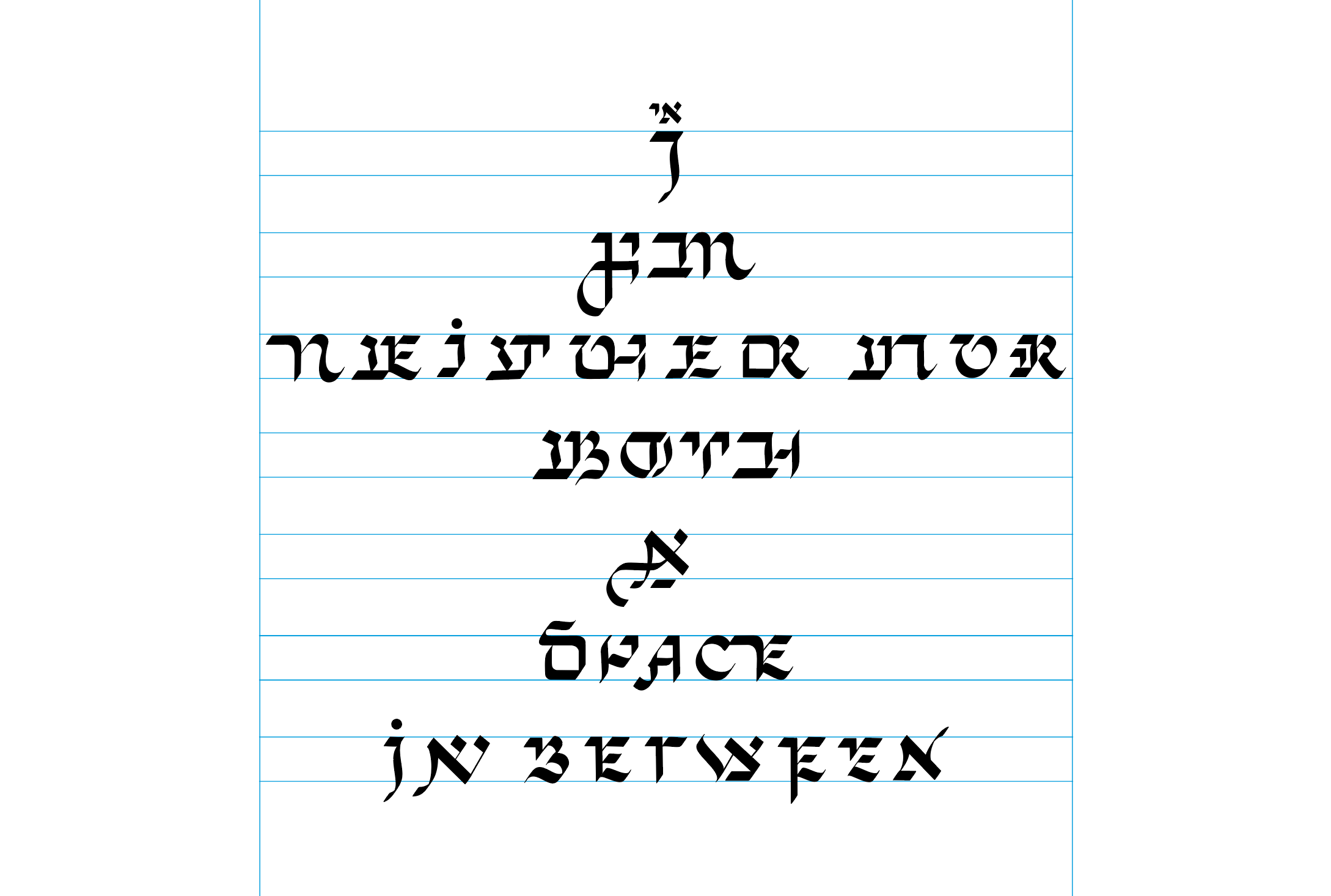
3. SOURCE TEXT: POEM
I
AM
NEITHER NOR
BOTH
A
SPACE
IN BETWEEN
FOREIGN
FAMILIAR
INFERIOR
DOMINANT
NOISE
SILENCE
SURRENDER
RESISTANCE
I
AM
SOMETHING ELSE
ALL
AT
ONCE
MORE
THAN
THE
SUM
OF
MY
PARTS
AM
NEITHER NOR
BOTH
A
SPACE
IN BETWEEN
FOREIGN
FAMILIAR
INFERIOR
DOMINANT
NOISE
SILENCE
SURRENDER
RESISTANCE
I
AM
SOMETHING ELSE
ALL
AT
ONCE
MORE
THAN
THE
SUM
OF
MY
PARTS
איך
בין
ניט דעם ניט יענער
ביידע
אַ
רוים
אין-צווישן
פֿרעמד
באַקאַנט
אונטערטעניק
דאָמינאַנט
רעש
שטילקייַט
קאַפּיטולאַציע
ווידערשטאַנד
איך
בין
עפּעס אַנדערש
אַלץ
אין
איינעם
מער
ווי
די
סומע
פֿון
מײַנע
טיילן
בין
ניט דעם ניט יענער
ביידע
אַ
רוים
אין-צווישן
פֿרעמד
באַקאַנט
אונטערטעניק
דאָמינאַנט
רעש
שטילקייַט
קאַפּיטולאַציע
ווידערשטאַנד
איך
בין
עפּעס אַנדערש
אַלץ
אין
איינעם
מער
ווי
די
סומע
פֿון
מײַנע
טיילן
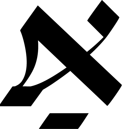
4. SHOWCASE
Full poem


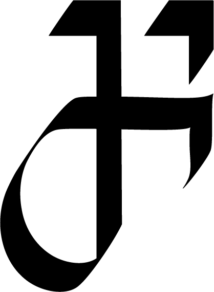


Selection, hybrid A:s

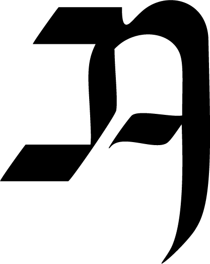
Latin (English): CALM + Hebrew (Yiddish): בלוט (blood)
6. TYPEFACE
If you are interested in trying out the latest version of the typeface, please send me an email with a short description of planned usage.
Thank you!